For neobanks, driving logins and user engagement is easier than ever with an income dashboard powered by Argyle.
Staying competitive in the banking market means keeping your users logged in, tuned in, and engaged with your app. The more screen time they give you, the more opportunities you have to lock in their loyalty and sell them additional products and services. But fostering that sort of affinity means you have to give them something of value in return.
Often, that something takes the form of a dashboarding feature, which helps users visualize critical aspects of their financial health in a centralized and digestible way. But building said dashboard can be a heavy lift and a distraction from your core product. To lighten the lift, we’re introducing Income Visualizer by Argyle.
Dashboarding in a jiffy
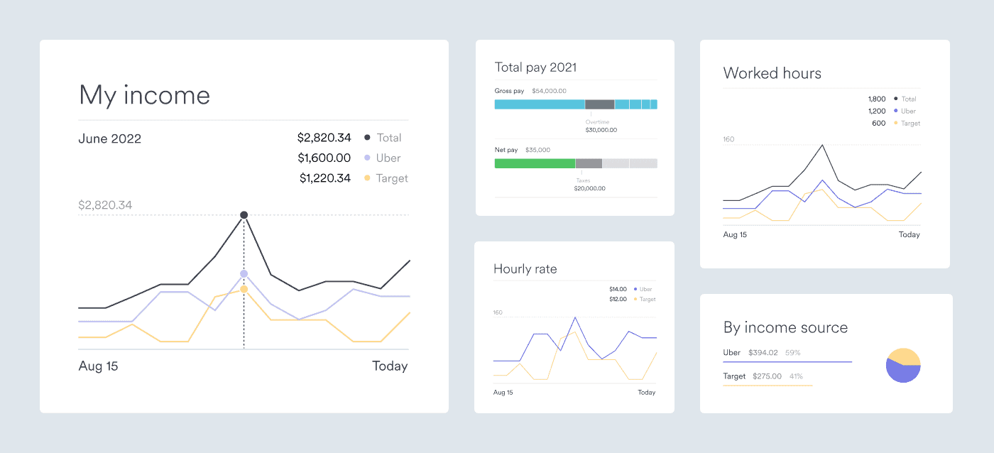
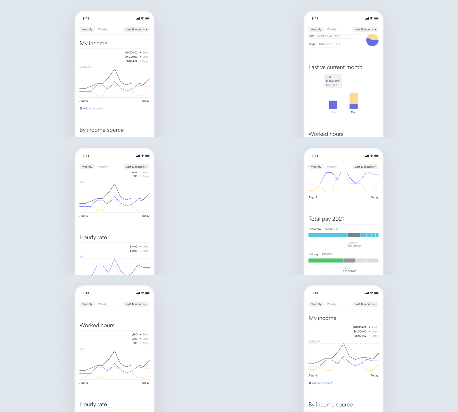
The Income Visualizer template, powered by Airbnb’s visx open-source library, makes it easy to lay and configure the infrastructure you need to create a functional, interactive dashboard. It aggregates user income data from multiple sources at once and presents it in filterable, customizable charts and displays.
The template is powered by the comprehensive income data Argyle retrieves on behalf of your users, including shift-level data like hours worked and hourly rate (if applicable). It even aggregates data elements unique to your users’ income type:
W-2 income
Gross pay
Deductions
Taxes
Reimbursements
Net pay
1099 income
Pay
Bonus
Tips
Fees
Income Visualizer data can be filtered into daily, weekly, monthly, and annual views and can compare data from different time periods to track and show change.
In turn, you can provide users with actionable insights like the pay they’ve earned but have not yet received. Or, if your user is a shift or gig worker with multiple income streams, you can leverage the data at your disposal to make valuable recommendations on how they can optimize their working hours to maximize income.
Let’s say, for instance, that a user has a free evening and is trying to decide if they should take an extra shift at Target or pick up some rides on Uber. Your app could compare their historical hourly earnings for the time period in question and identify which job offers them the best chance to make the most money.
These are just two examples of the income intelligence you can provide, but there are many possibilities. The key is surfacing the information that keeps your users coming back for more.
How we pull the data
If your users are already switching their direct deposits seamlessly via Argyle—by linking their payroll accounts directly to your app or platform—then they’ve already established the connection they need to power Income Visualizer.
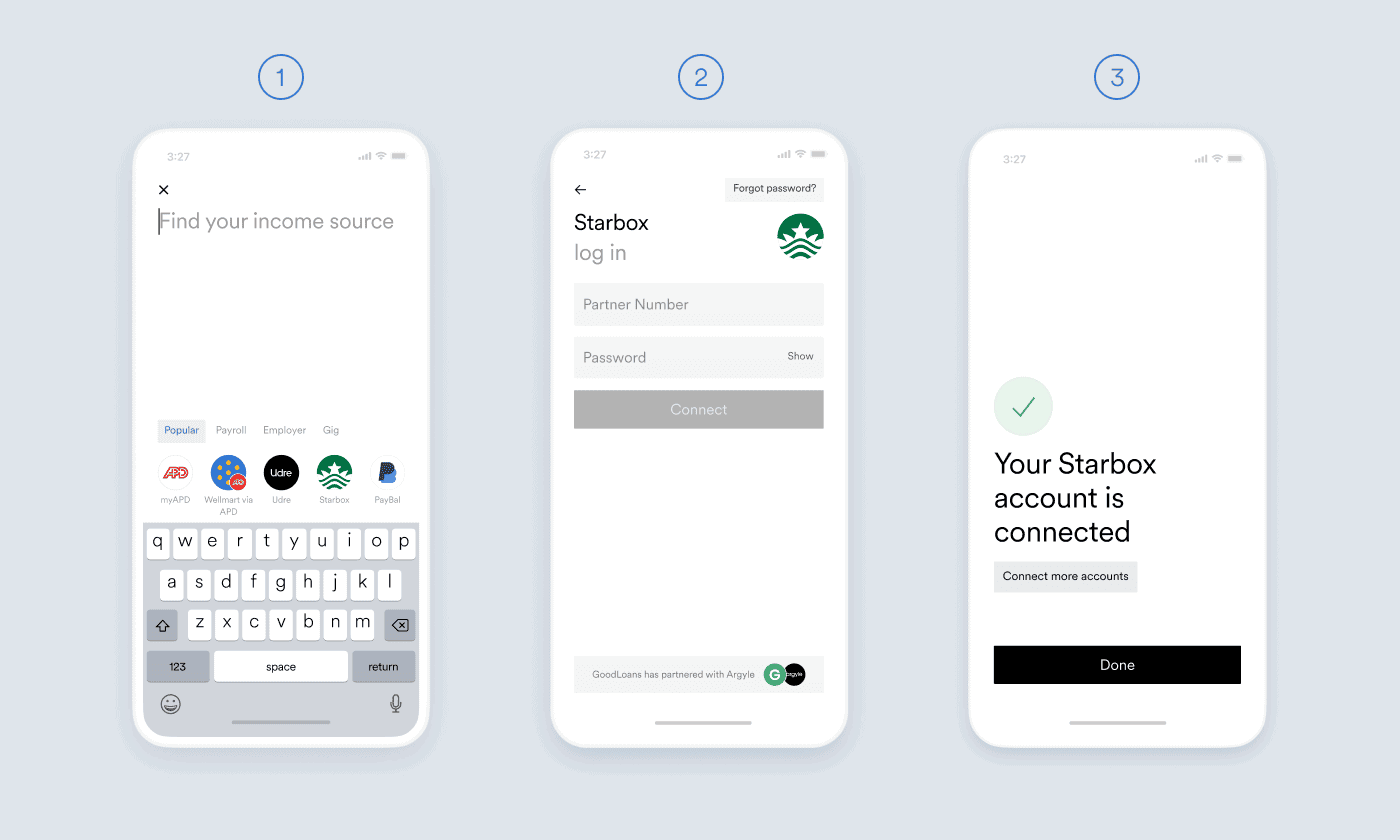
If your users haven’t yet established a connection to their payroll accounts via Argyle, the process for doing so is simple:
1. Users locate and select their payroll account through Argyle’s secure, embeddable front-end modal.
2. Users enter their login credentials to permission a connection.
3. Users repeat steps 1 and 2 if they have multiple accounts to connect.
The entire workflow takes just a few moments. Once the connection is established, data is updated continuously and in real-time.
Ready to put income intelligence at users’ fingertips?
Adding an income dashboard to your app or platform is critical to differentiating your product in a competitive market—and now it’s easier than ever.
Click here to demo Argyle’s Income Visualizer app in your browser or reach out to our team if you’re interested in learning more. In the meantime, if you’re not yet an Argyle customer, sign up to start building in our sandbox for free.
